Well, after a lot of requests for a " how to " on doing aged wall signs, I decided to document a small wall job that I was doing. This is my first attempt at a "Step by Step" so hopefully it's informative and also interesting. Painting signs that look old and weathered is probably one of my favorite types of sign work. I do a lot of this type of work for the Film Industry and recently have been getting requests from designers and owners of retail stores and restaurants. The process isn't that difficult if you plan it out. The one thing I would suggest is to get some reference material by taking pictures of old signs or look on the Internet. Signs age in many different ways depending on where they are, which way they face (sun or shade) or what type of climate they're exposed to. For the most part, people just want them to look old, but still be legible. My favorite surface to work on is brick, the rougher the better. I find it lends itself well to this type of work. I work mostly with water-based paints, but will use oils when needed. The type of brush I use depends on the surface that I'm working on. When painting on brick, I use fitches and other stiff- haired brushes that I find at the local art stores. Imagine trying to paint a sign on gravel, and you'll have an idea of what it's like to letter on a rough brick wall or stucco. Now that I've covered the basics, lets move onto the job. This project is the final piece of a larger job that I did in the summer for a well-known shoe store called John Fluevog Shoes. They had found me through the internet and wanted some signs done for their new store opening in Calgary. When doing the construction, they had uncovered a old sign that had been painted on one of the walls that went up through the roof of the building. It was an old billboard that was done at least 50 years ago, and the building been built against it. They wanted me to design and hand paint the company logo and another sign with the company slogan, to match the sign they had uncovered, and to match the weathered look also. The project that I'm using for the " Step by Step" is two directional signs for their Museum and Gallery.

This is a picture of a 60' sign that has their company slogan.
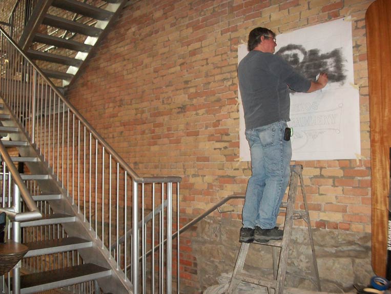
A picture of me hard at work.
Their company logo.
Once the customer approves the design, I prepare a pattern of the design. Depending on the job, I decide if I'm going to lay it out by hand / project it or make patterns. When working on location, I find that making patterns is the best approach, because projecting is not an option due to light issues and space needed to project the layout, not to mention the public and people wanting to make shadow puppets while you're trying to work. You could do the layout on the spot by hand, but why waste the time.
Step 1: Create the artwork. Here's the approved design.
Step 2: Create a pattern. As I mentioned before, this can be done in a couple of different ways. Because I had done the design on the computer, I used my plotter to generate the pattern.
Here's the pattern before pouncing. For those of you that might not know what making a pounce pattern is, it's to perforate the paper with small holes so that when you rub chalk over it, the design is transferred to the surface you're going to letter. This can be done with either a pounce wheel or an Electro-pounce machine; the Electro-pounce is by far more fun to use, there's nothing like a good zap of electricity to keep you on your toes.
Here's a picture of the pouncing process. I prefer using the Electro-pounce because it's quick and simple, but a pounce wheel will work just fine.
Step 3: Apply the pattern to the wall.
Step 4: Pounce the design onto the working surface. When working on a rough surface, it's best to apply pressure around the area being pounced. This helps to get a good pounce and prevents the pattern from tearing. I always have a drop-sheet on the ground to catch the pounce chalk and paint from messing up the floor.
Step 5: Now comes the fun part, start lettering. As I mentioned before, I work mostly with water-based paints. For this type of job, I use regular house paint. Because it's indoors and is supposed to look aged, regular house paint works just fine. I also use a clear mixing base of the same product line to cut the color to make it more transparent. Two tricks that I use are to mute the colors and to make it more transparent, that way it looks old and faded without too much effort.
I find cutting in the letters allows the brick to show through the white. Another trick is to tint the white with some Raw Umber and Raw Sienna to give it an aged look. You can use either paint tints or artist colors for this step.
Step 6: Now it's time to add some aging. For this sign, all I'm going do to is add a wash to knock back the colors and pull it all together. If I wanted to distress it more, I would use a process called block-aging to bring the background out. I used a lot of block-aging on the large wall sign ( Unique Soles sign) to make it look really weathered. I'm planning on doing a "Step by Step" on block-aging next, so drop in and check it out.
I mix a wash color to look like muddy water, about 10% paint / 90% water. Then put it into a spray bottle, it's a good idea to pour it through a strainer. Furthermore, if your mix is too thick, the sprayer will plug up. Spray the sign with the wash. I will usually have one sprayer with clean water and one with the age wash. It's not a big deal if you spray the brick, just spray some water and wipe it off.
Once you've applied the wash, use a wet rag ( t-shirt type works best) and with a patting type motion, wipe the age off (make sure to not take it all off). You must do this part quickly or the wash will start to dry. If this happens, you'll need to re- letter the sign and lose money. You can apply a second or third wash coat, depending on how faded you want it to look. If working in a hot environment, spray some water down before applying the wash, or mix a little paint extender into it to slow down the drying.
Step 7: Finish the job and collect the money, and don't forget to take a picture. This type of job is a lot of fun to do, there really isn't a right or wrong way, so have fun.
Hope this was informative. If you have any question or comments, I would be glad to hear them. Thanks for taking the time to check it out. Watch for more up-coming "Step by Steps"