Sunday, 10 March 2013

Painting Picture Vehicles for the Film Industry

When I started in the film industry, I mostly painted signs. But because of my background as a painter the Auto body industry, it also gave me some new opportunities. Well, one thing leads to another, and before I knew it, I was painting tanks and helicopters. It started when a pilot and his crew ran into trouble trying to paint their own helicopter. The production designer (Ken Adams of the early James Bond films) suggested I give them a hand. This started me down the road to painting picture vehicles and aircraft for films and commercials. I must admit they I always felt a little nervous when it came to aircraft painting. You have to be very aware of how serious it could be if something goes wrong.

Painting vehicles and aircraft can definitely be a challenge. It can range from a temporary paint job that has to be removed, to a paint jobs that are permanent, or it doesn't really matter as the vehicle will be destroyed in the end ( my favorite one). Sometimes in involves lettering and graphic, other times, create the military look, or just make it look weathered and old. I've always found the film industry a place where you can put all your skills to use. Just be careful what you tell them you can do, you will be tested. Here's a few pictures of jobs I've been involved with. Thanks for taking the time to stop by.


Here's a few working photos of the hummers and snowmobiles that were painted for the movie "Inception" They were in Alberta filming part of the movie, and asked if I could get a crew together to do the paint. All the camouflage was done by hand,  using a water based paint and brushes. We didn't have to worry about the paint jobs lasting, as they were going to be destroyed  in the end. You have to love the film business.


 We only had a few days to get everything painted, so painting by brush saved a lot time by not having to mask anything. The production designer was great to work with. He went ahead of us and did the layouts That way we could just focus on the painting. It doesn't happen that often, but it sure is nice when it does.


This is one of the trucks from the movie "Brokeback Mountain"  We started with a perfectly good paint job. Then we created the faded and weathered look over the existing paint. We worked on top of a wax coat so we could remove the paint when filming was done. Unfortunately, the person cleaning it decided to use scrub pads and trashed the paint job. In the end, it all worked out as the owner was really hoping to get a new paint job .


This is a old school flame job I did for a movie called "Santa Baby" It was for the Santa character who was going through his mid life crisis. When I was working on the movie Inception, I found out  the person in charge of the snowmobiles had ended up with it. It was funny to see it again. Glad I used One Shot and clear..


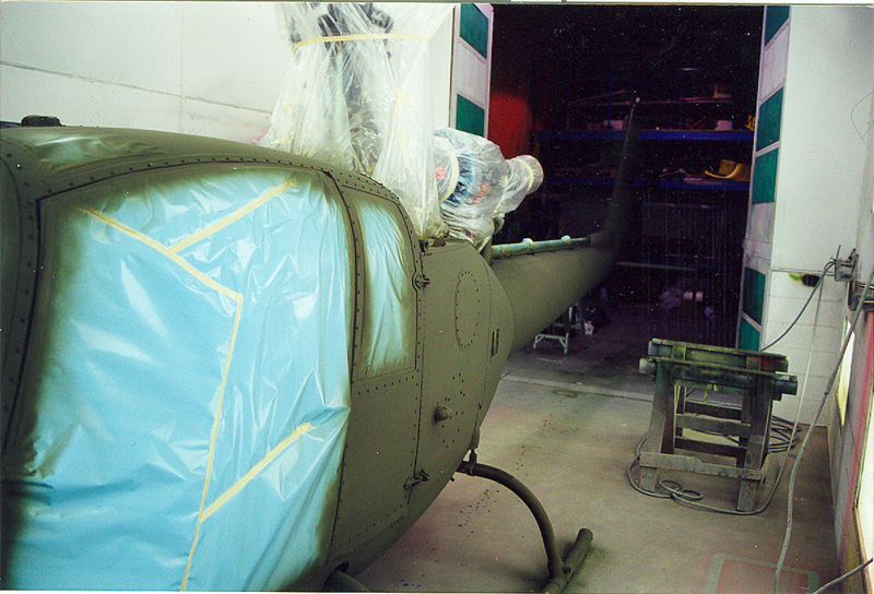
Here's a few pictures of military vehicles done the the movie" The Forth War" I started out painting just the signs. But through a turn of events ended up painting military vehicles and a helicopter. Made for some long days, but also a nice pay cheque.


This was for a Miller Beer commercial. First it was sprayed with the product Sign Strip so it could be removed after filming. Then we hand painted the stripes and lettering. You couldn't use any tape, as that would run the risk of lifting the paint. That could be a very dangerous situation in flight. I moved away from using Sign Strip for that very reason.


This is a helicopter I painted for the TV show "Harsh Realm" It was a temporary paint job using floor wax and tempera paint. This was a very cool helicopter work on, similar to a high performance sports car.


Another temporary paint job for the movie "Chill Factor" I ended up painting 2 Hueys and a Gazelle for the show. A few years later I heard the fellow who owned the Hueys had been killed in a crash. It was sad to hear as he was such a nice person. It also reminded me of how important it is to make sure nothing I do interferes in the operation of the helicopter.


.


Saturday, 9 February 2013

Thinking of a new "Step by Step"

I get asked a lot about how I go about getting that "Aged "look. I was thinking about doing a "Step by Step" on how to achieve a weathered sign. Just wondering if there's any interest? If there is, let me know, and I'll put something together. Here's a few pictures of what I'm talking about. Thanks.


Monday, 21 January 2013

It's not hand painted, but it is hand done.


This is a quick job for a client that wanted something different for their washroom signs. I did a heritage building a few years back, and had  produces molds for the washroom and mechanical room doors. The masters for the molds were created by first cutting the letters and border from 1/4 MDF board, and then epoxied them to another piece of MDF, and then shaped the backing piece to match the boarder profile. This is not a job for the faint of heart, as the fingers tend to get a little close to the scroll saw blade. Once I had it glued together, I used a Dermal tool to create the background texture. You may think it would take a lot of time to do, but it only took around 15 minutes per sign. Once I had the texture, and final sanding finished, I brushed a few coats of epoxy on to seal the letters and boarder to the backing plate, this creates a molded look to the sign. You must take care with this step, as you don't want to fill the background detail with epoxy. Once I was satisfied with the piece, it was time to make a mold. I used a 2 part urethane rubber mold compound for this step. Two things you want to watch for,  build a good bridge around the piece to keep the rubber in place, and make sure you get no air trapped when pouring the molding compound. A good trick is to use a brush to apply the rubber to the surface, and then pour the compound. This helps to eliminate the chance of air getting trapped, thus ruining the mold. Once you have the mold, the rest is pretty simple. I use a urethane casting resin for the actual sign. Depending on the final color, I will tint the resin to match the final color of the sign. For this job they wanted a gold finish, so I tinted the resin with Bronze powder. That way it takes very little paint to get the desired effect. Once the clean-up was done, I applied a few coats of bronze powder carried in clear, using an air brush. Here's a few progress pictures. Hope you enjoyed the post.


This is the masters that was used to make the mold. The ladies sign in the gold color was a test cast. Unfortunately I didn't take any pictures when creating the master or mold, as this was before I started blogging.


Here is the finished rubber mold, ready to use for the casting. When using Urethane for casting, you want to make sure to use a release agent so as not to wreck the mold. You may not have a problem, but why take a chance.

 I mix the bronze powder into the "A" component and mix thoroughly. Then add the "B" component to activate the mix. You have a couple of minutes to pour it in the mold before it starts to go off. Not a good time to answer the phone.


Now it's just a matter of pouring the resin in the mold. I find that if you start by pouring it in the lowest parts of the mold, then let it flow to the rest of the mold, it will chasing the air out as you go. This way you don't trap air in a letter or part of the border. 


  The finished cast before the clean-up. I lay the signs on the face so they will cure flat, as the backs of the casts can be a little uneven. I will then let then sit over-nite so the resin can cure.

 And here's the finished sign, complete with paint. I could go in and apply a glaze to darken the background, but it's not needed for this job. If you have any questions, feel free to leave a comment, or send me an email.
Thanks for taking the time to drop by.

Saturday, 12 January 2013

First post for 2013

Well, 2013 is here, and with it comes new challenges. The phone started ringing January 2, and hasn't stopped. Looks like it's going to be a good year for hand lettering. I spent most of last week lettering and pinstriping some vintage visible gas pumps. I'll post some pictures when I finish. This is starting to turn into a interesting sideline for me. It's not the usual type of work that I do, but I do find it enjoyable. It diffidently challenges my brush skills. I was fortunate to pull in a Ghost Sign project just before Christmas, thanks to a friend who was doing some paint work for a new pub. They had applied a faux brick finish to the wall, and wanted a sign that looked like it had been there for awhile. The owner supplied me with a basic design, and said I could re-design it to what I felt would suit the look. Here's a few pictures of the project. They also want a few more aged signs on the columns around the pub. I decided to try a new technique for the aging process on this job, and am quite pleased on the outcome. I'll be putting that process into my little bag of tricks. Thanks for dropping in, and keep your emails coming. It's nice to hear from you.


Here's a copy of the artwork they provided me with. Although this type of layout would work in print and on the web, it doesn't lend itself well to a wall sign from the 50s. It's nice that the client gave me artist freedom with the design. Wall signs from back in the day were designed to get their message across in a straight forward way. It seems that signs today are all about the wild graphics, and hard to read copy. 


 I decide to reverse the white and black, as it makes it more like the signs that would have been done back then, also it keeps it readable when aging. Another point is to use fonts / letter style that would have beeen common for the time period.


One of the steps I do on a project like this, is spend time in photoshop to generate a mock-up of what the sign will look like. That way, the customer knows exactly what to expect. Saves a lot of time and grief in the end.


After applying the layout, it's time to paint. For this job I decided to make a pounce pattern. Although I could have done the layout directly on the wall, I find using a pattern saves time, plus people are fascinated with the whole process.
 

I did the black first so I would have something to base the value of the white against. If I had painted the white first, I run the risk of making it to bright. I tried a new process of working with very transparent paint so I would maintain the brick color coming through. Once you lose the brick, it's very hard to get it back, and then have to spend more time on the aging. Using this new approach makes it look old and fade with very little effort.


Here's the finished sign, almost. I still have the top of the sign to finish, but I had to wait on the brick and ceiling people to finish before painting the top. They just called and told me it's ready. I'll probably do a wash coat just to settle the colors down, and make it part of the wall tone. Hope you find this interesting. If you want, send me a email, or post a comment if you have any questions.

Sunday, 11 November 2012

Painting Signs for the Film Industry

                                                                                                                  Working on the set of "Open Range"

  I thought I might revisit a post I did back when I first started my blog. It was about painting signs for film. I started in the industry back in 1987, with a show called " Return to Gunsmoke". It wasn't until the movie "Dead Bang" staring  Don Johnson, that I moved into the role of a Film Sign Painter. From that point on, I worked as both a sign painter, and scenic artist, on a number of different television productions and feature films. I then made the transition to Paint Coordinator ( Head Painter) overseeing all aspects of the Paint Department. Although I enjoyed the position, and the challenges it brought, my heart was really in painting the signs. The thing I really like is not so much the actual lettering, but the breakdown of the sign, making it look like its been there for a while. Don't get me wrong, I do love lettering, but find the aging and breakdown to be the big challenge.

Painting signs for a film production can be quite a challenge. First part is the high volume of signs that you are given, then the time frame that they have to be done in. Some of the shows I've worked on,  the crew is myself, and maybe other person, on a bigger show, I will have a larger crew. The process starts with the Art Dept. designing and supplying the artwork for us to follow, then the Construction Dept builds the sign blanks and buildings for us to letter. Depending on the show setup, either the painters paint the blanks, or we take it from the raw wood up. Personally, I like working from the raw wood stage, that way I can start the aging process from ground up. I recently watched a western from the early 90s , although the signs were well done (not sure if they were actually hand painted) the colors were not muted, and some of the white lettering was so bright, it competed with the actors and the action. Great for anyone watching for signs, not so great if your the actor in front of it. I personally like to paint them by muting the colors, so as to pull the contrast down. You'll still see the signs, but they fall nicely into the background. If you've ever done any landscape painting, you know to diminish the color value to create the illusion of distance and depth, the same rule applies to film sign work. Another thing to keep in mind is, it would be very unlikely that the same sign painter did all the signs in the town. Having a varity of styles, and trying to simulate different skill levels, helps to create a sense of reality. I will try to establish this with the Production Designer, or Art Director, by asking if they want a "Left hand" or "Right Hand" sign. By this, I mean a good quality, or bad quality sign. It's just the same as doing signs in the real world. Drive down any road that has stores and shops and you'll notice a what I'm talking about.

When painting signs for film, you have to be prepared for anything. One day you'll be doing sign blanks, the next day, building facades and windows, then wagons, vehicles and awnings, show cards, and so on. Depending on the time period, it could be anything. I work mostly with water based paints, but use what ever is needed to get the job done. This type of work helps to round out you lettering skills, not to mention your stress level., it's one thing to paint a few signs, try painting a few hundred in a given time frame. The show I'll be starting should be in the area of 200 to 400 signs.For this, I'll need a crew of no less that 5 sign painters, and more as needed. When I first hire someone who has never done film work, they're quite excited, then they see the task at hand, then you can smell the fear. But by the end of the show (if they make it) they fell a real sense of accomplishment, plus they get bragging rights. They can tell their family and friend  "If you look really hard, way in the background, That's a sign I painted." Over the years, the need for someone to actually hand paint signs has dropped, especially with the new technology in printing, but fortunately there are still designers that appreciate the look of a sign done by hand, that has style, and a soul.  Thanks for taking the time to drop by, hope you enjoyed the post. I'm sure a lot of you know this already, if you click on a picture, it will show as a larger version, you can also scroll through them in order by clicking on the photos.


This was a set from the TV series Lonesome Dove. It was an episode about Buffalo Bill, played by Dennis Weaver. We got to paint the canvas banners and a number of signs for his traveling show. I thought I had died and had gone to Sign Painter Heaven. It was also a bit of a challenge, due to the fact we had a week to pull it off.


 Here's a few on-set pictures from a show called "Magic of Ordinary Days. It wasn't designed to be a showcase for our sign painting skills, just a piece of background to help establish the time period of the show


A typical day of painting for two sign painters. This type of work is done mostly in the studio workshop,  then sent to the location to be installed. It's a great way to stay out of the weather, unfortunately it's not always the case. You have to be ready to work in all types of weather when you do this type of work. The show I'm about to start, will have a combination of studio, and location work, in the middle of a Canadian Winter, thank god I love what I do.


Here's a few pictures of wagons and tents. No western is complete without them. You also paint a lot of canvas banners. Hard on brushes.


This "Before and "After" is of a set from the movie "Brokeback Mountain." The Mexican set was the most fun to do, although we did get to travel around the country side, lettering towns as we went. Can't think of a better way to spend your day.


This is an example of covering up signs on a location. This was a show that used a historic park here in Calgary. We make blanks to cover existing signs and then add more signs to create the look. This is a very common practice when working on a location. The one issue I run into when doing location work is, them wanting me to paint a sign directly on to a wall or building. I use a different approach for this type of sign, as it has to be removed when we finish filming.


These are a few photos from "The Assassination of Jesse James" It was a big sign show, with over 300 signs hand painted. I had a crew of up to 7 sign painters at any given time to get the job done. These pictures are from the city of Winnipeg. They changed 3 city blocks over to look like Chicago in the late 1800s, complete with dirt roads and board walks. Although we painted a pile of signs, you would be hard press to see them. That's just the way this business works.


This is a picture of a facade that was built to cover a modern building. The wall sign in the background wasn't part of the shoot. Because the camera wouldn't be facing this direction, it was of no issue. But things can change in a hurry, so you have to be ready to paint it out with a minutes notice. Ah..life on the edge. You won't get that kind of rush flipping burgers.


  Here's an example of  one of the window signs that had a little more detail than other signs on the street. There was a total of 4 of these. This was a painful job to do. The floor was 6" under the "Gents Clothing" copy , and the only way to do the lettering, was to lay on the floor. Not the most comfortable way to letter, but it had to be done. As I mentioned earlier, location work can have its challenges. Hope you enjoyed a little insight into the world of painting signs for the film industry. Take care.