Saturday, 7 December 2013

It's not a sign, but it is hand painted.

I received a call from a production company wanting some scenery for a set. They needed a 5' x 8' waterfall painting from a reference photo they had. The turnaround was tight, only one week, that included picking up the materials / prepping the panel, and finalizing artwork and details. But hey, that's what a good challenge is all about. The substrate I used was Alum-Panel (same as Dibond), which was available in a 5' x 10' sheet.  I decided to use artist acrylic due to to tight deadline, plus I like painting with them. The beauty of working with acrylics is the speed that they dry, plus they're water based and have great color.  The reference they provided was reasonably good, but it's only the starting point. Once you start, the painting takes on a life of it's own.


 I start by sanding and priming the panel with B/M Fresh Start. This product is designed to adhere to the enamel factory finish on the panel. The next step is to do a rough layout so I can block in the values. For this step I use black gesso. I picked up this technique from a workshop I did with a well known Canadian artist named Mike Svob. Just click on his name to check out his website.


Now that I have the basic layout and values established, I can start to add color. This is where the fun begins. The nice thing with using artist acrylics is the speed you can work , and on this project, I can use all the help I can get. It's also amazing how far a small tube of paint can go when pallet mixing.


With the color added, it starts to take shape. One important thing to keep in mind is the end use of the painting. It will be used as background for a scene being filmed, not a fine art painting for a gallery or home. You still have to make it impressive, but careful not to get bogged down in detail. It's always a fine line when doing this type of work. Paint the big picture and add detail as time allows. It helps to take some of the stress out of the job.


The finished painting. Overall, the job went off without a hitch, and was ready for pick-up on the promised date. Although I enjoy the process of painting the artwork, I also enjoy watching it go out the door, as that means it's time to get paid. I'd rather be a working artist instead of a staving artist, I've tried the starving part, and it wasn't much fun.

 A shameless promo shot to give you a sense of scale. All in all, it was nice to do something other than signs. It never hurts to challenge yourself. No pain...no gain. Thanks for taking the time to drop by.
 

Friday, 15 November 2013

It's Official...My first Distressed Sign Workshop

After years of painting and distressing signs for the film industry, I decided to put together a workshop. It will be a 2 day workshop held at Swinton's Art Studios. The class will be limited to 12 students, to make sure I can do some one one one. I get a lot of inquirers in regard to the painting and aging processes I use on movie sets, so it seemed the perfect fit. So if your in the Calgary area, or like to travel, this may be of interest to you. I was told yesterday that its half booked, so there may not be a lot of time left. If it's popular, I may do another one down the road. You can get more information at: http://www.swintonsart.com/instruction/workshops/item/distressed-sign-painting


Monday, 11 November 2013

Painting Highlights on Cast Letters

I recently did a job for a client that collects and restores  old gas pumps and different types of memorabilia. He had a Texaco pump base that he wanted the lettering and logo highlighted. Anyone who's involved with collecting or restoration will have to deal with this at some point. Although it's not a really complicated process, it does take time and patience, it also it helps to use the right brushes and paint. The paints I use are for painting signs. One Shot, or Ronan lettering enamels are the brand I use. One Shot is available from stores selling sign supplies and such, Ronan is readily available in the states, but only from one suppler in Canada carries it. Brushes can be a little difficult to find, but can be found online. If you are planning to clear coat the piece after, you'll need to use a hardener made for the lettering enamel. One Shot makes a hardener that works with both brands. As for brushes, I use liner brushes and sign quills, as they hold a nice edge, and have good control. Most of the brushes you get from the local art store aren't suitable for this type of work, and will only add frustration to process. It's amazing how much easier a job becomes when you use the right tools. The process is the same whether it's a gas pump or a piece of equipment, and it really adds a "WOW" factor to the project.


This is the base my client wanted the high-lights on. I can't stress enough about adding hardener if it is going to be cleared. If you don't, the clear will attack the lettering enamel. If you're planning to clear with an enamel based product, you won't need the hardener.  For this job, I didn't have to worry, as it wasn't going to be cleared. Most of the projects I work on, they use urethane, so hardener is a must. Care must also be taken with the first few coats, which should be dusted on to prevent it for attacking the lettering enamel.


Time to start highlighting. For this I use a liner brush, as it is narrow and doesn't fan out as much as a quill. The trick is to stay in the center of the letter. Once you get the hang of it, it's just a matter of being patient, and watch the line width. Cast letters are far from perfect, so you may have the odd challenge with straight lines and curves, but hey, that's part of the fun. If you have to second coat, depending on the color, you already have the letters established, and it goes quickly.  


With the white finished, it's time to move onto the logos. This part can be a little more challenging, as you will be dealing with different shapes, not to mention the missing details. This piece had a poor casting on the word Texaco, and also the Reg. Trademark copy. The trick is to just keep it clean.


Now the piece starts to come to life. Care must be taken when painting ovals and such, as a sloppy job will ruin all the hard work you've done on the lettering. If you make a mistake, just take a rag with some paint thinner, and wipe it off. It's just that simple. Better to start again than try to work a bad line. People only see the final piece, not all of the challenges you had doing it, so take your time and do it right.What's that old saying again...oh ya  "Practice makes Perfect" So don't worry, it's only paint.


 A picture of the finished piece. My client was thrilled to say the least. It really does bring out the beauty of an industrial  piece of equipment. With just a little paint, and a little more patience, you can turn the average piece into a show piece. Hope this helps. If you have any questions on this project, or any of the others, just drop me a line. Thanks for taking the time to stop by.

Sunday, 1 September 2013

A simple Gold Leaf sign

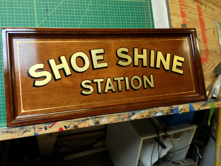
Sometimes they don't have to be fancy, just effective. I recently did a sign for the Best of Seven Barber Shop that does it all "Old School", complete with straight razor cuts, and yes, shoe shines. I felt they needed something that got your attention, but not too over the top. Nothing seems to work together better than some stained wood, a lot of varnish and Gold Leaf, a true winning combination. The nice thing about a sign like this is I get to use my skills in wood working / paint finishing and hand lettering. That's a big change from painting signs that look old and faded for the film industry. Although I didn't have a chance to film me doing the actual work, I did get some pictures of the sign a different stages of completion. When it was finished, I had the added bonus of a client dropping by and liking the look so much they ordered a similar type of sign for the historic building where they work. It's sort of like fishing, put something shiny out there and see what bits.


The first step once you finished the sign blank is to transfer the layout. I like to use a pounce pattern for this type of sign as it produces a clean layout to follow. Although you could lay it out on the blank, why bother.


Once you have the layout transferred, it's time to get on with applying the size for the Gold Leaf. I don't worry about transferring the outline or drop shadow as I'll eyeball them in after I apply the leaf.


I used a mixture of Rolco quick size, and a bit of One Shot Chrome Yellow for the lettering. Adding a little color helps when doing the lettering so you can see what your doing. The size on it's own can be a little difficult to see as it's transparent. Be careful not to overwork the lettering as it will show up in the finish gild. You don't have to be real precise with the corners when lettering because you can clean them up with the outline. You should also be careful if you have to push back the size, as the gold will want to stick to it.


The first step done, now it's time for the outline and shadow. At this stage you have two directions you can take. One is to brush varnish over the Gold, the second is to leave it and hope you don't screw up with the outline. Getting paint on the leaf is not a good thing as it will leave a stain. I find clearing the leaf kills the brilliance of the gold. But there are many applications where it's necessary, such as in high traffic areas, or on a vehicle that is going to be washed. This sign will be on a wall in the shop, so it should be fine.


The sign is almost finished at this point. I managed to make it without going into the gold. The only thing left is to permanently attach the trim and add the boarder. Although I could get away without one, I feel it finishes off the sign, just my personal preference. The other thing is to check that you didn't miss any strokes on the outline, like I did on the "N". It may sound basic, but it's easy to do. Better to catch it now instead of when it's installed


     The finished product. Everything on the sign was hand painted, including the boarder, with no tape or stencils being used in the process. Hope you enjoyed the post. Now it's time to get onto my other projects that are waiting, and I do have some interesting ones on the go. Thanks for dropping by.

Sunday, 11 August 2013

Another Aged Sign Job

I just finished another of my favorite types of sign jobs, the distressed sign. A good client of mine recently renovated their Pub in Edmonton, and asked if I would do a distressed sign in the front entrance. Being one of my favorite type of signs to do, I asked what was the address and off I went. Part of the fun of my job is the road trips, I've always enjoyed traveling for work, regardless of the distance. I rolled into Edmonton around 11 am, and had the pattern on by 12. After recording the National wall job with my iphone, I thought I might make another video of this job. Although this one doesn't show me lettering, it does show the steps. I still have work to do when shooting these videos, but the more I do, the better I get... I hope. The sign was done using regular latex house paint, and then using the clear mixing base to cut the color as it makes it more transparent. I will usually start by "cutting-in" the letters and boarder (paint around the letter instead of filling it in) as I have more control on the transparency of the sign. By doing it this way, you don't make the white to bright. On that note, the white is actually a greyed down white to keep in the value scale of the background. To finish it off, I mix some warm tones to "Block Age" the surface and bring out the grain. It also helps to soften the sign so it doesn't hit you in the face when you walk in the door. In the end, I was happy with the look, and so was the client, which is the most important part. All that was left for me to do was to turn up the tunes and head for home. On another note, I've had some requests about putting together a workshop, just wondering how much interest there is out there. Drop me a line if you have an interest and I'll see what I can do. Thanks.


         The finished sign. All hand lettered, no tape or stencils were harmed in the making of this sign.


                                                   A short video on the making of the sign.

Monday, 5 August 2013

Hand Painted Sign for the National Bar.

I just completed a job for one of my clients, and thought it would make a good post for the blog. It was a typical wall job downtown Calgary. I'm not a big fan of working downtown due to parking and such, but I do like painting signs. I also thought I would use my iphone to record the process. I recently retired my trusty Motorola Razor for the new iphone 5, and decided to try out the camera for both its still and video functions. I must admit it worked well. It was a straight forward wall job, nothing fancy. I decided I would layout the star by hand and use patterns for the copy. With the star being 12' high, it made no sense to use a pattern, instead just a level / tape measure and a piece of chalk was used. Once you find the center of the wall, it's all just measurements. The wall was painted with a semi gloss latex, so to eliminate any problems I used the same paint product for the lettering. 


Looking up at my blank canvas. They all start the same. The first thing I do is establish the horizontal center. This job would have looked better at the top of the wall, but had a permit issue. I'm not a big fan of heights, but am willing to overlook this small detail when it comes to making money. It doesn't look that high when looking at it from the ground, but is a different story when on the lift.


Star layout completed. Layout done "Old School" using a level / tape measure and chalk. First I drew a vertical line, then a series of horizontal lines to get my points. From there it was just a matter of connecting the lines. One of the tricks I use is to use masking tape to make sure the lines run straight from the points. I work by myself on most of these jobs so I don't have an extra pair of hands. I could also use a chalk line, but they can be a pain to anchor, and also remove. Everyone has a different way to do things, this method works well for me.


Just to give you an idea of the tight quarters I had to work in. It was a busy alley with a lot of traffic, so I had little room to park my truck. But hey, I didn't have to pay for parking. Just on a side note, Calgary has one of the most expensive Downtown parking rates in the world.


Next, I layout the copy. I used patterns for this step as it saves time, and gives me the freedom to move the layout around to suit the space. The layout provided by the Architect was different than what I ended up going with. One reason being the the permit, it stipulated the height I had to start the sign at, also to prevent graffiti. Tagging is always a big issue when working in the downtown core. You also have to be aware of how it reads in the space, what looks good in a drawing may not look the same on the wall.


The finished wall. Overall, the job went off without a hitch, though the heat was a bit of an issue. The day I started was overcast with a chance of rain. I don't usually start if there's a chance of rain due to possibly of losing the layout, but I felt lucky. The next two days for the lettering and re-coat seen temperatures in the high 20s. With the wall facing south, it was hot to say the least. I thought I could smell  bacon cooking, then realized it was me. One of the big problems working on a hot wall is that it bakes the paint into the brush, no matter how wet you try to keep them. In the end, it means more time at cleanup as you have to soak the brushes in methyl hydrate to get the dried paint out.

Here's a little video I made of the job. I decided to give the iphone 5 video recorder a shot, and must admit it worked out not too bad. Forgive the camera shake and the odd shot out of frame, but I was both camera man and sign painter. I just shot another little video of a distressed sign job I did in Edmonton, and applied what I learned from this one. Watch for that post coming soon.. Thanks for dropping by.