Thursday 19 January 2017

1912 Waterous Steam Road Roller Restoration

        What better way to begin the New Year than with the restoration of a Waterous Steam Road Roller.  These machines were in service for the better part of half a century beginning around the 1904, and played a crucial roll in road construction in Canada. While these Canadian machines were made in Brantford at the Waterous Engine Works Co., they shared a striking resemblance to the Buffalo Pitts Roller, as they were built under the same license of Buffalo Steam Roller Co. of New York. However, as you can see from the illustrations, the similarities end as the pin striping designs between the two steamrollers are completely different.
As you can see, the striping designs differ from the Buffalo Pitts Roller pictured below


Buffalo Pitts Roller


     This Waterous steamroller is being restored from the ground up as part of the restoration collection for Heritage Park located in Calgary. After coming off the production line in 1912, it is believed that this steamroller was used in Fernie, British Columbia before being decommissioned and transferred to Heritage Park collection in the latter part of the 20th century. As you can see, this machine has seen its fair share of wear and tear over over the decades - almost all of the original hand lettering and pin striping has disappeared. That called for a trip out to the Reynolds museum to try to find more evidence.


Current state of Waterous steamroller


Buffalo Pitts in original condition
          If you are ever looking for inspiration - The Reynolds-Alberta Museum is the place to go. This place is full of eye candy - especially behind the scenes.😉 The museum was founded by Stan Reynolds. Stan owned a car lot and was notorious of trading to add to his collection. Not kidding, Stan collected everything from antique cars, to agricultural equipment, to airplanes and military paraphernalia. So much so that acres upon acres of fields were lined with rusty machines.


View from inside Buffalo Pitts Roller

Behind the scenes at the Reynolds museum, this was just one of several hangers

Beautiful detailing on a fire apparatus

         Returning back to the Waterous steamroller, the museum had not one, but two steamrollers in their collection - one Waterous, and one Buffalo Pitts. After careful inspection of the Waterous Steam Road Roller, it was deemed that the paint job was not the original, and thus, the pin striping was not either. While the pin striping patterns on the Buffalo Pitts differed from the Waterous, it was still in quite good condition so it was a great opportunity to snap some pictures and archive the patterns.Cross referencing the original illustrations to remnants of pin striping found on the machines we were able to gauge what the original designs may have looked like.
Remnants of striping on Waterous steamroller

Another image of striping pattern on spokes of Waterous

      With a clear vision in mind, we could return back to home to prepare the designs for the steamroller. Stay tuned for updates of the restoration process.  


Saturday 26 November 2016

How to create a faux rust sign.

Here's a fun little project to try. I start with a piece of Dibond composite panel, and do a quick scratch layout, nothing fancy. I used lettering enamel to do the copy, then let dry. Once dry, I take some isopropyl alcohol on a rag, and rub over the letters to remove the paint. It's a personal choice on how much you want to remove. It's also a good idea to go with the direction of the strokes, makes it look more natural. The rate the paint comes off will depend on how long it has cured. Best to do a few tests first to se how it works

The next step is to use poster paint, either One Shot poster, or Ronan Japan Color, to paint the rust around the edges and scratches on the face. For the rust colours, I use mixtures of brown / black / orange, and yellow. I just pallet mix the colours to keep it simple. I then let the sign dry for a while. If you do the next step to soon, it will remove the poster paint.

The last step is to do a few wash coats to give it the final aged look. For this step, I use paint thinner, tinted with the rust colours to do wash coats. I stand the sign vertically, and with a brush loaded with the paint thinner mix, go along the top and let it run down the face. I will alternate between the tinted thinner and clean thinner to move the wash evenly down the face sign. On a larger sign, I would use spray bottles. You can also do the same with water based paints. I just decided to use oils on this one. Hope you find this of interest. Comments welcomed.

Saturday 16 April 2016

Step by Step: Making a weathered sign with a simple technique called Block Aging.

 Here's a little "Step by Step" on using a simple technique called Block Aging It's a great way to get that weathered sign look with a lot of work.. It's just one of the many techniques used in the film industry. For this type of sign, I like to use a rough plywood, or rough cut board, because of the wood texture. It's really quite a simple process, just put paint on a wood block, drag it over the surface, and voila, instant aged sign. This project was done using water based paints (cheap house paint.) Except for the raw umber age, for that I used artist acrylics. Let me know what you think.


Step 1: The raw sign blank. I like to use a rough plywood for this type of sign, it  gives you lots of texture to work with.You can also use something with a smooth surface. It just give you a different look.


Step 2: After coating the blank out with a flat latex paint, it was time to do the lettering Nothing more than a quick layout, and it's time to paint. Because this Step by Step is about Block Aging, I didn't spend much time on the layout, it just shows the steps. Not that you should spent much time on  a layout for this type of letter style. The brush should do all the work.


 Step 3: It's letter time. For this step, I  used latex house paint, mixed to a muted ivory colour. And a Series 2179  #10 Mack quill, to do the lettering. If you using a water based / water borne paint, make sure to use a brush that's designed for the paint.


Step 4: Once the paint has dried, you can start to block age. The nice part of working with water based paints, is how fast they dry. To Block Age, all you need is a block of wood. Any scrape wood will work, although it should be smooth. I use different sized blocks, depending on the size of pattern I want. Now the fun begins.


Step 5:  Put some paint on a larger block, And rub the blocks together. This spreads the paint evenly on the surface of the smaller block. I even managed to get through this demonstration without getting paint on my pants. By the way, the One shot reducers in the one picture was just on my paint cart at the time, and wasn't part of the process.


Step 6:  Once the block is loaded with paint, lightly drag it over the surface of the sign. I start with the background colour to break up the lettering. You can also mix a few different shades of greyed wood, and base colours, and repeat the process. When applying the paint, it's best the think about how a real sign would age. It really helps to make the aging look believable.  


Step 7:  Now I add the aged wood colour. For this step, I'm using a smaller block for more control. A little goes a long ways.


Step 8:  Next step is to add a little raw umber wash to tone down the colours, and give it an old weathered look. If you were doing a bigger sign, a pump sprayer, and spritzer bottles would be used. For this sign, I used a spritzer bottle and a rag to apply the wash.


     The finished sign:  Start to finish, little over an hour. This is a fast process, and works well to create that distressed look, fast and dirty. Hope you enjoyed the step by step.

Monday 5 October 2015

The rise in popularity of the painted Ghost Sign.


I seem to be getting more request these days to paint ghost signs in pubs, restaurants, and stores. In the film business,  it's just another day at the easel or wall. Out of all the different types of sign work I do, the ghost sign is my favorite type of sign to paint. Aging a sign to look believable takes a little work to get it right, from the background colours and breakdown, to the lettering itself. I can't say I'm a big fan of crackle paint finishes, but everything has its place.

One thing that can really help to pull it off,  is to start a collection of reference pictures. It's best to separate them into categories, such as various stages of aging, from the slightly aged, to the ones you can barely read.  Also, signs painted on different surfaces, wood , brick, metal and such. It makes it a heck of a lot easier when you want to find a reference for the job you plan to do.

 To make a believable sign, you really want to pay special attention to the brush strokes. Paint breaks down in different ways, and so does the lettering. If you pay close attention to those little details, it makes it a lot easier the paint a convincing ghost sign. If you are doing a job for a paying customer, you should really put some extra attention into the layout. Nothing spoils a good ghost sign more than a terrible layout. If your not strong at lettering, look at actual signs for reference.

If you're just doing them for fun, or for friends, it's not as important, but it doesn't hurt.  Sometimes you get to design the sign, other times, you'll be working with client supplied artwork. You may feel the design could be improved on, and it doesn't hurt to make a suggestion or two. If they insist that's what they want, then that's what you paint. You could tell them their design sucks, but you probably won't be doing the job after that. Here's a few examples of some of the recent, and past jobs.


Hand painted ghost sign for the TV series "Fargo" 2nd season. It was painted on a surface that was already breaking down, for real. They wanted something interesting to fill the big blank wall. I got luckily with the weather the day I was suppose to paint the sign.  It was still early spring, and quite cold during the days. As luck would have it, a Chinook blew in, and it turned into a beautiful day. Thank god for Alberta Chinooks.


Painted for a local pub. They wanted that "old warehouse" look. The trick with this type of sign is to keep it simple and clean. Also, watch how strong and opaque the colours are. I tend to work with very transparent colours, then build up as needed. It's also a good idea to mute your colours, black more into a grey, and white pushed to a grey ivory. Then the sign has an aged look when you finish, and you don't have to spend time breaking it down and aging it.

Working on my favorite surface... brick. This was a job where the designer wanted to create the effect of one sign over the other. I also added a broken white wash to the brick to back up the sign.  They then hung old speedway photos to add to the decor.

  A close-up to show the breakdown detail. It really helps if you put a few layers of aging in the colours.


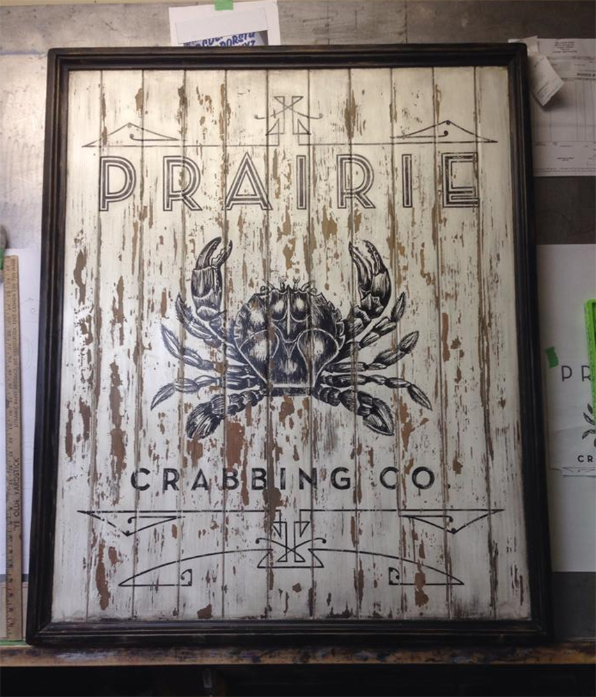
Another piece for decor. New sign painted and aged to have a rustic feel. I really enjoy making this types of sign. Lets me use my limited wood working skills along with my painting skills. The crab painting looks complicated, but is really like a pen and ink illustration, just takes time and patience. I used a release before painting the background so I could remove paint at will.


Pretty straight forward lettering on a concrete wall. They wanted to fill the space with some proverb, and also have it look like its been there for a while simple and fun.


Another simple brick job. Quick to do, and very effective at filling space. The trick with this type of sign is to keep the colours muted and transparent. It's easier to add more paint than to remove it.


  Sometime it's all about filling the space. They were also using the slogan in their marketing campaign.
 

 This would be a good example of painting what the client wants. Although I could have improved on the lettering, it was part of their existing logo.What they wanted was a sign that had that old "faded metal sign" look. The sign was for a charity event at this years Sturgis Bike Rally. And from what I heard, it did it's job and raised money for a good cause. It never hurts to be part of something like that. Thanks for dropping by. And free to post a comment or send me an email if you have any questions.


Saturday 3 October 2015

And I thought it would be a regular sign shop.

Back in 1987 I started what I thought was going to be just another sign shop. Within a short period of time, it turned into a full blown scene shop. It wasn't long before some very talented artists started showing up on my doorstep. It's funny how they just seem to find you. It was a real education working shoulder to shoulder with them on a daily bases. It was the type of education you couldn't get from school, except for the School of Hard Knocks. Keep in mind, this was before the computers and CNCs came in in to the picture, although the Gerber 4 was just starting to make inroads into the sign industry. Everything was done by hand, both painting and fabrication. The days where spent pounding out backdrops, murals, signs, and props. It was a crazy time to say the least, but was also a blast. Kind of miss those day, must be getting old.

 Hand painted canvas panels. I believe it was 10' x 40'. It was painter for the Vulcan Space Centre. They wanted something that the tourists could  have their pictures taken in front of.  It was designed to have the end panels folded in, creating the illusion of being on the deck of the Star Ship Enterprise. 


What really helps to sell big paintings like this, is trying creating a sense of depth through the use  light and shadow. If all else fails...make it look cool.


    This project was designed to brighten up the halls after a  major  store pulled out out of the mall.
We would come in early, before the mall opened, so we could project the layout  for the day. All the layouts were done using  light blue pencil crayons (non photo). That way you didn't have to erase any lines as they were only visible up close. And it also kept people wondering how we could paint the images with no layout to follow. Had more than a few come up and ask.


You can never go wrong with a circus mural, people seem to enjoy looking at them. As long as you don't have a clown phobia or something.This project really got a lot of attention people went down the hallways just to check out the mural.


These are made painted trade show props. It's amazing what you can do with a sona tube, and some muslin. If you sand the ribs from the spiral off,  and glue muslin to the surface, you get a get a nice smooth surface to paint on.


More product displays for a trade show. All the lettering and graphics were hand painted back then. The boxes themselves, were build from cardboard. The first vinyl cutter was just starting to make it's appearance, but was still in its infancy stage. It didn't take long to see the writing on the wall. Big changes were coming to the way  signs would be made, and being skilled at lettering wouldn't be so important, if needed at all.


This was the store front done for a baggage company. It was sculpted out of styro foam, then coated with a product call Foam Coat. The silver base coat was water based clear, mixed with aluminum powder. Graphics were all hand painted. There is also a tail section and mural inside the store. 

 
Most of the sculpting was done by my brother Randy. Using a model kit for the layout worked great, everything was to a scale, we just sized it up to full scale. I still have the model kit, but never got around to putting it together. Maybe it could be a winter project. Complete with Buffalo Airways graphics:)

 The mural was painted on muslin in the shop. After trimming the canvas to the shape of the hanger, it was taken to site, and glued to the wall using wall paper paste. It's a great way to do commercial jobs. You only need to be on site for the install. It can be a bit of a challenge to say the least, working on site with the trades, who are also trying to get their work done. But I have seen some interest hand shadow puppets when project the layout. 

Friday 2 October 2015

Crazy jobs from the past.

Back in the early days of Streamline Studios, we did a lot of crazy stuff. But this is one of the projects I remember the most. We use work with a special effects company called Unreel Effects, making props, just so they could destroy them. You never had to worry about a warranty. The Stampeders Football Club wanted to do some kind of big western welcome for the Argonauts, and their newest Line Receiver... Raghib "Rocket" Ismail This is back when John Candy and Wayne Gretzky were co owners of the team. They decided they wanted some kind of gag involving a rocket. Before we did the job, we thought it might be a good idea to do a test. So we made a small rocket pod, and blew the hell out of it in the parking lot behind the shop. We were like a bunch of little kids that had just smashed the neighbors window, running and hiding in the shop. Nowadays I would be writing this from a jail cell. But things were different back then. Funny thing is, the cops didn't even show up.


Setting up before the game. Jim from Unreel Effects, is reassuring the fellow from the stadium that everything will be just fine. Thought I would stay out of that conversation.


 The rocket in all its glory. built completely out of Styrofoam, gantry included. The biggest thing with working with props and explosives is not to creation projectiles. We used rubber cement and tooth picks to hold it all together. No matter how big the blast, the foam only travels so far.


 Count down on. On 3, the gantry fell away, and smoke began to bellow. If you look at the people behind, you can see some of them know what's coming.


Unfortunately, it wasn't to be the Rocket's day. It made a hell of a bang, and I think some people actually thought it was going to take off. We must have set them off their game as they lost. Mission accomplished.