Sunday, 8 July 2012

Reproducing other peoples designs

Part of being a sign painter is reproducing other peoples designs, whether a designer, or business owner with the dreaded "nephew art." There's a fine line between trying to be helpful, and or offending a potential client. I've been very fortunate over the years to have worked with excellent designers and business owners who respect my opinion on what works or what doesn't. However, I've also had my fair share of  bad designs, the ones I won't be taking pictures of for the portfolio. I realize as I get older, I might not see the change in trends and taste as much as the youth and markets of  today. But on the other hand, good design is still good design. People come to me because they know regardless of how complicated or how out there their design is; I'll paint it to the best of my ability. If I see something that's not working, I may suggest looking at it a different way. The bottom line is, you're a brush for hire. I know there's no point in complaining about it because it offends my design pride. On the other hand, it doesn't hurt to suggest something to make it a little better. One thing's for sure; if you push to hard, you won't be getting the job. I've made a living painting what people want, not trying to change their minds. With the age of computers, things have become a little more challenging. Designs that are easy to create on a computers, can be very difficult to re-create by hand. What takes a click on the computer, can take hours to paint. The other problem is what looks good in print or on a monitor, may not look the same painted on a wall. The reality is, if you want to make a living painting signs the "Old School" way, you have to work with the client, regardless of the challenges. I just finished a job that was full of challenges, between the wrong clear wood sealer, a logo that challenged my brush skills, having to paint tight lines over 3 1/2' wood planks. Not to mention the weather, either rain or a hot sun with no shade. In the end, the customer was very happy, and the design was faithful to the designers' work. Not to mention I was paid to do what I love doing, painting signs. One of the big perks of this job was the ice cream, they make it from scratch.  Thanks for dropping by.


Monday, 2 July 2012

1913 Canadian Pacific Box Car restoration

Recently I started a restoration project on a 1913 railway box car for Heritage Park in Calgary. The project was being done by Brian Manning, who is also the Chief Engineer at the park. With the first part of the job done, I"m now in the process of making the patterns for the remaining lettering. This was a tough one due to the lack of information available for the lettering layout. The problem you run into on jobs such as this is the railway didn't save the shop drawing from 1920 and earlier. The only source of information is from photos, which are also very difficult to find. I have the good fortune to have a friend that is extremely knowledgeable when it comes to railway equipment, not to mention his vast network of historians and collectors. I ended up re-creating the lettering by using a photo as an underlay and then re-creating the lettering in my sign program ( Flexi Sign). By measuring the height and width of the area to be lettered, and also the plank width on the siding, I came up with the layout. From this information, I was able to make a pattern for the graphics. Once the pattern was pounced it was time to go over and hang out at the train barn. There's something relaxing and rewarding about working on these old pieces of history. The stories they could tell, just think, 1913, just imagine what they've seen. Enjoy.


 These are just some of the working photos, I'll post more when I finish. Thanks for dropping in.


It's not paint, but it's close

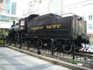
Just finished a interesting job this week. I was approached to do the lettering on a A1e No. 4-4-0 class locomotive that was in the process of  being restored by CP (Canadian Pacific). It's a static display in front of  the Gulf Canada Square office towers downtown Calgary. At first I was asked to prepare a budget to re-create the layout and then hand letter the engine and tender car. They then also requested I quote the job using vinyl. Not my preferred way to do the job but that's what the client requested. In the end, they decided to use vinyl to due to the budget. A big part of the job was going to be digitizing the lettering and numbers back to the Canadian Pacific lettering specs so they could be cut in vinyl. The engine and tender had been done previously with the wrong font and color (also done with vinyl). With the help of a few close friends, I was supplied with photos and the information  needed to re-create the lettering and numbers. Now it was time to get down to doing the digitizing of the lettering and numbers. There are no digital files available of the font and number that I know of, so it had to be re-created letter by letter. Over the years, I've created quite a collection of patterns and layout for engines / passenger cars/ cabooses and working cars. All of the other restorations jobs I've been involved with were done by hand, both layouts and lettering. This would be the first vinyl job, so a digital file would be needed. The interesting thing is, if done right, it's hard to tell it's vinyl from 20' away, plus your not on site near as long. Here's a few  photos of the #29 back in the day..


Now that I had the lettering and number diagrams, it was time to start digitizing. The first step was to scan the letters and numbers, then create a vector image. I used Adobe Illustrator and Flexi Sign software to do the digitizing  work.

 After spending hours in front of the computer rebuilding the letters and numbers, I had my file. The next step was to cut the vinyl and do the install. Because I was fourtunate to have factory specs for placement and size, it saved time by not having to count the rivets from old photos, which is what I would done on previous jobs. The only thing the specs didn't provide, was the kerning (space between the letters) for the lettering. All they gave me were the overall sizes. Now that that part of the job was over, it was time for the install. With the help of my friend Joe Mattatall, we installed the graphics on the engine and tender. The install took 4 hrs. to complete, not including travel time. It would have been nice to have hand lettered the job, but it all comes down to money, you either accept the customers request, or you don't get the job, plain and simple.. Hope you enjoy the post as much as I enjoyed doing the work. Thanks for taking the time to drop by. Comments are always appreciated. Watch for my next project, I think you'll find it to be quite interesting.




Thursday, 31 May 2012

Red River Special...number two

 I  received a call recently from a person in Colorado, she had seen my blog on the Red River Special  threshing machine I had lettered, and was wondering if I would be interested in helping to re-create the graphics on their Red River Special. They had recently purchased it and were in the process of doing the paint work on the body and wheels, but needed help with the graphics. The machine had been kept in a building for a number of years, but the lettering was not in the best of shape. Some of the letters and parts of the logos were no longer visible. After emailing back and forth, we decided I would fly down and help re-create the graphics. I had done one Red River Special, so was excited to work on another. When I arrived, I was surprised to find that the outline around the letters was actually a gold metallic instead of a yellow that had been used on the previous machine. The problem you run into with this work is it's often very difficult to find any reference or details about the graphics, or colors used. The lettering on the first one was so far gone; it showed no signs of the gold metallic color. But the yellow tint that would have been used in the gold paint, stained the white used in the silk screen process from the factory. Because this one had been stored in a build for a number of years, there was still  gold metallic left in some of the graphics. We decided to do all the outlining in the gold instead of the yellow, and with a call to Midwest Sign Supplies in Denver, managed to get some paint sent to us the next day. We returned the pinstriping back the way it was done from the factory, wavy lines/ paint smears and choppy corners. Back in the day the pinstriping would have been an assembly line type of job, finish one and move on to the next. After all, these were working machines, not show pieces. The job had its challenges, between awkward angles / poor lighting and a wind storm that hit wind gusts of 55 to 60 mph., it  made working on the machine almost impossible. The wind blowing in the door was so strong, it was actually blowing my liner brush sideways from the surface. Part of the experience of  jobs like this are the problems you have, and what you do to overcome them.  Robert and Sally were the perfect hosts, making me feel right at home and feeding me like a king, not to mention the great conversations and a lot of good  jokes. They were very hands on,  both gave lettering and striping a try. Sally ended up doing most of the striping, and by the time she was finished, had really mastered the striping brush. The thing I like the most about a job like this is the people you meet along the way. Here are some pictures of the job. Hope you enjoy them.


Saturday, 19 May 2012

Great design reference.

I think one of the best references for color and design can be found in the old fruit and vegetable crate labels. They can be invaluable when it comes to creating great looking signs that also have that period look. They were designed to get your attention from the moment you looked at them. With the use of a strong layout, combined with good color harmony, they just have that look you don't see anymore. They married lettering and graphics like like no other form of advertising. Over the years I've collected a large number of these labels to be use on different projects. One of the things I enjoy doing is re-creating these labels by hand. It  not only challenges your lettering skills, but also your artistic skills, plus they look good on your wall. Here's just a few examples to get your creative juices going. Take some time and give one a try, you won't be disappointed. Comment welcomed.


Sunday, 6 May 2012

A couple of upcoming projects


I'm just getting ready to start a couple of new and exciting projects, re-creating the graphics and lettering on a 1913 Canadian Pacific Box Car, and also a turn of the century Big 4 Gas Traction Tractor. Both projects require rebuilding the graphics and lettering layouts from scratch, as there is no specs available. It can be quite a challenging, but also very rewarding, plus I get a little history lesson to go with it. They might not be the most fancy lettering jobs, but there's nothing like working on pieces of equipment that has so much history attached to them. I'll be documenting the progress, and will be doing a "How I went about it," complete with pictures, when I'm finished. I also have another project coming up, involving re-creating the graphics on a historic threshing machine, so drop in from time to time if you have an interested in this type of work. Here are some reference photos of the two projects currently underway. Thanks